DESIGN AND LAYOUT RESEARCH - preliminary task
For my preliminary research I have been looking on school newspaper from local schools in order to find out what they included in the layout and what features they contain.
I found out that most school magazines have:
· Title/name of newsletter (mast head)
· Main headline
· coverline
· News on talented students
· News on talented students
· barcode
· selling line
· main image
· Content page
· selling line
· main image
· Content page
Genre and audience
After researching into different school magazines, I have decided to do a sixth form magazine aimed a students between the ages of 16-18. It will include information about up coming events and opportunities - not just inside school, but in the local areas as well. There will also be dates and information on catch up classes and extra activity available for all students.
RESEARCH AND PLANNING
EXISTING FRONT COVER - ISSUE 1

EXISTING FRONT COVER- ISSUE 2
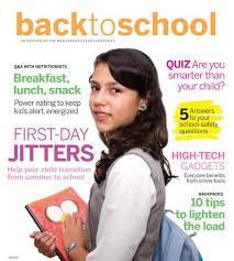
This back to school magazine is very effective as the white back ground makes the image in the middle stand out, and create a professional finish. The simple COLOUR SCHEME of pink green orange and white is soft and easy on the eye. TEXT: The font also work well and it help the reader separate and identify the different information. You can tell clearly who and what the magazine is about and and the content inside which means the magazine is successful. IMAGE: the picture of the girl relates well to the magazine and has been edited well on to the front cover. PROP: the bag and the books create and very smart appearance and make the magazine look particularly educational. Overall i think this is the best out of the three examples as it has just the amount of each element necessary.
EXISTING FRONT COVER - ISSUE 3


This is the mock up for my magazine cover, like most covers I will have the master head at the top with an image in the center and text around the edges (plugs). After looking at other covers I have decided to use orange blue and white as a colour scheme for my magazine, to make it stand out from others.


The image on the left is going to be on my front cover, I edited the image on the right to create a more professional looked. I changed the background for a white backdrop as it enhances the colours and makes the three people stand out much more. The 3 people are meant to symbolise the kind of people who go to sixth form so it was important that they look smart yet still friendly and approachable.
CONTENT PAGE RESEARCH RESEARCH AND PLANNING
The layout of this content page is weak compared to the one below. The red writing stands out well against the grey background but there is to much blank spaces. This content page may look better if it had a border. On the other hand, hand images on one side and writing on the other works well i will most likely use this when designing my content page.

This is an example of an effective content page. The colour scheme works well, fewer colours make it look more professional. The long shot image looks good but maybe would be better if it was slightly smaller allowing the text to be made a bit bigger. having the sub headings with a red background attracts the eye to them and the detail under each heading is useful to the reader.


These are the three shots I took for my content page. They are all from slightly different angles. I have come to the conclusion that the image on the left isn't appropriate because the male looks unhappy and would give off the wrong vibe of sixth. The image in the centre also isn't quite right ether as I think the image would be more successful if the male was looking straight at the camera rather than off into the distance as it looks to staged. The image on the right is the most effective of the three and I will use this on my content page.

1. The update - hiragino kaka gothic std |
2. The update - kokonor |||
3. The update - blackmoor LET
4. The update - Herculanum ||||| ||| << this is the font i will be using on my front cover my the master head.
5. The update - lucinda grande |
6. The update - courier |||
7. The update - curlz MT ||||
These are the fonts I was thinking about using for my cover and content page I asked people in my year to pick which font they liked the best. After asking 20 people, it was clear what they thought of each font I found that people liked the 'herculanum' font the best as it was quirky yet easy to read. They also said that font 1 and 5 were too boring and that font number 3 wasn't very clear and hard to read. Font number 3 looked too much like a newspaper title therefore i wont be using it and even though font number 7 got the second highest amount of votes i think it would make the magazine look like it was for a younger audience than it is aimed at.

This is my final front cover. I have used my research to try and come up with the most successful finished look. The image in the middle is the main focus of the magazine. And the plug in are there to intrigue the reader to buy the magazine. The mast head 'The update!' works well because it represents the focus of the magazine, to keep students in the know and up to date with up coming issues. I used the colours orange, white and black as they aren't usually used in many magazine covers therefore it would stand out from the rest. It also adds colour and makes the magazine look more interesting .

This is my final content page. It has a very simple layout, yet include all the information needed to be successful with out overloading the reader with too much.