This is my double page spread research and planning, I have research into existing double page spreads to see what work well and what doesnt look as good.
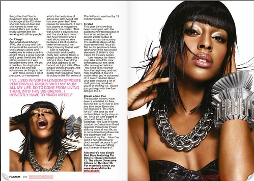
IMAGE: The main image is very straight on and direct. The raise of her chin suggest she has authority or is looking down on people. The use of a lot of make up implies the R&B industry is popular of beauty artist and young artist feel the need to better there appearance.It is also hard to identify what her facial expression, whether she is happy or sad, this creates a sense of mystery and may make the reader want to look more into the article. Her jellery is particualry big and is probably there to make a statement as well as enhance her look to create an R&B dive personality. A wind machine has been used when taking this photo, this makes it look lets natural and give it more of a hollywood edited style. The smaller image on the right could be recieved in many way. I think she looks in pain and quite angry but this could be to show her passion and love for the music as well as capture the attention of the reader.
TEXT: Anecdotes have been change to pink in this article to seperate them from the rest of the text. This emaphasis the information and allows reader to have a quick clance at the most dramatic parts. Sub headings are also used to summarise each paragraph. The text used is very specific to the artist and quotes such as 'dreams can come true' are extremely cheesy.
LAYOUT: The layout Is effective with images taking up most the space on the two pages. It means less wtiting is needed too have a impact. And often readers prefer to look at image rather than text.
COLOUR:The are very few colours in both the image and the text. The pink text adds a feminim touch to the double spread and the black font makes it look more serious. The white background in the images links it well to the white backgroung of the text making them compliment each other.

IMAGE: The side on angle is different to most double page spreads, but work well in this as it shows Alicia Keys personality. Her earings are very big and would be considered as 'bling' showing features of stereotypical R&B artist. Her outfit looks quite dated but ties in well withe the style/font of the mast head. The holey effect on the jumper means more flesh is show but without being to revealing, which is suitable for OMG magazine.
TEXT: The main focus of this double page spread is to inform readers about the interview. The contrast between the red and black font makes it easy to identify the questions and the answers. The mast head is particularly striking on the page, her name is up in light this highlights her famous status. The caption beneathe the mast head summarises the interview, as the explanation mark at the end implies the interview has dramatic elements which wouldbe exciting to lead.
COLOUR: The colour scheme is very simple on the page, which is a good thing because too many colours distract the attention aways from the written text. The red quote over the top of the image would normally look strange and be hard to read but as the jumper is so dark it makes it stand out, therefore making good use of the space on the page. The white background is very common in double page spreads it allows the text to be mixed with the image with out any background colour clashes.
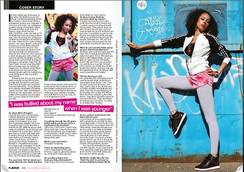
IMAGE: There are two images on this page, they are both set in front of graffitied walls, which sugest this is related to R&B music. Her outfit/pose also implies some sport or dance element. She creates a very dominant facial expression showing confidence and believe I what she is about.
TEXT: The use of emotional quotes have been highlighted in pink, this draws the reader in and makes you feel sorry for the girl. the font size is quite small allowing moretext to be filled on the page. The small paragraphs also make it easier to read and break down the large amount of text. There are lots of subheading and quotations that divide up the page.
COLOUR: There is more colour used on the spread compared to any of the others I have analysed, I think it works well in this circimastance as it goes with the image the girl is portraying as a child child with some attitude.

IMAGE: Lady Gaga is well know for her outragious appearance, normally wearing unusual outfits. This image is fairly simple however she is wearing any clothes making her look quite natural. The necklace look like chains round her neck, maybe simbalising she is tied to something, her messy hair further supports this as its very scruffy. The photo is close up, focusing on her face neck and shoulders. The relaxed expression on her face shows she is comfortable, but is confusing to the reader what emotion she is trying to convey.
TEXT: The layout of the three columns included alot of writing with few breaks, Prehaps to much writing for the style of magazine I will be producing. The big L is very striking on this page and is symbolic of Lady Gaga, however it makes some of the text hard to read. The mast head is quite small there for doesn't stand out that much on the page.
COLOUR: The use of black and white editing on the image make lady gaga's skin look flawless, marks and blemishes seem to disappear. The red L is a very vibrant in contrast to the gray scaled background. Making the page very memorable.
I have decided my double page spread will be based on the artist Miss Kelly Jay. Including a interview between her and the magazine writer. These will be the questions and answers I will you on the double page spread:
Kelly jay, everyone has been loving your recent releases. What have you got planned for the future?
The main aim is to release a new album in the summer and hopefully tour around Europe next year. I love meeting up with my fans and want to travel all around the world.
That sounds promising, what songs should we expect to here on the new album?
Well it is currently in the making process. We are writing the songs now, but they are all based on my own experiences and things i've learnt from people I aspire to be.
So do you write all your music?
Yes, well me and my manger agree on it together. It normally starts with me writing it now and then him changing it slightly to suit the music industry.
You said you base your songs on who you aspire to be. Who would you say was your role model?
I’d have to say Beyounce. I think her songs and videos are amazing. I used to try copy all her dances from her videos, but I was rubbish.
Where would you like to perform in the future?
I think the o2 has to be the ultimate aim. I think if you have played at the o2 you have been successful in the music industry.
You have played in many places around the UK, who would you say was your best crowd?
Manchester was brilliant; I was there last summer. The crowd were so energetic, I think it was my best performance so far.
lot of people have been wondering if you would ever go into a band or perform along
Side someone else?
Maybe in the future, but right now I’m happy performing on my own and I like having control of my performances and what I sing.
A I see, do you think you'll be making a music video any time soon?
Yes, I plan to release my video for understatement next January. We've been working on it for a month now and its really starting to come together.
We love your casual style. Do you pick out all your own clothes?
Yes, I wouldn’t want people choosing what I wear. I think it’s a very personal decision.
You’ve warn some pretty amazing dresses in the past, which has to be you favourite?
The gold dress I wore to the MTV award has got to be up there, I loved being so sparking and the bling that matched top it all off.
That’s understandable. We hear you getting quite close with jack white from ‘The end’ should we be right to assume something is going on there?
I don’t think you should ever assume, we are just very close friends, we always have a laugh.
There is certainly a lot of new artist this year, coming in to the charts; do you think you can keep up your high profile in the charts?
I’m definitely ready for the competition, but who knows what will happen in the future.

These are the images I will be using along the top of my page. I decided to make them black and white as I felt it looked more professional. I used photoshop to get rid of the backgrounds and place them next to one another. I wanted to use a range of photos to try show as much personality as possible and make the character realistic as I can

I then went on to add a pink group of lines to separate the page as well as the main image center left. This suited the image as when I took the picture I cut of the top of her hair so the lines allow me to still use the image.

This is my final double page spread. I used the same colours as in my front cover and contents page. After I had added the text I soon realised some of the images didn't look right, especially the one in the middle. The rotated angle didn't work, so i change three of the images to others. Now I have added the text the page look a lot better.
After recieving feedback from my target market I plan to make a few changes such enlarge the mast head and it isnt big enough in comaprison to the rest of the text. And correct a few gramitical errors.