CONTENT PAGE
Research on content page features and layout.

IMAGE: there is only one main image on this content page. The image of Katy perry is an iconic representation of artist today. It suggest the image that young people feel the need to aspire. The long shot stand outs against the pale background, And the big mushroom attracts readers. The proportion of the mushroom against the size of the person is abnormally unusual, this is one way in which the have tried to make there magazine different to the average magazine.
TEXT: The mast head is particularly bold. The Features column is very small compared to the rest of the page, where it could easily be spread out more to make more use of the page. There are several sub headings to help the reader navigate around the magazine. All the fonts are fairly simple, which is good as many complicated fonts make the text hard to read.
COLOUR SCHEME: The first thing I notice when looking at the colour scheme is the pink and turquoise colour font I think they stand out too much and doesn't really fit in with the rest of the page. Most the font is black, which suggest the magazine is fairly serious.
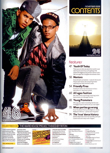
IMAGE :The main image on this page of the two guys, squatting down emphasis some of the features of R&B when referring to image. As the way they are dressed with a flat cap, jacket and style of shoes all show that image is important to these artist. The use of glasses is unusual to be be seen associated with R&B. They give the impression the person on the right is fairly smart.
TEXT: There is much more text on this page compared to the front cover above. The font used for the numbers is unique for this magazine. the text at the bottom of the page is very condense and may put some readers off.
COLOUR SCHEME: White black and yellow are the main colours in this page. The white background works well as it is the same as the background of the image, creating a link between the two. The striking black behind the two main headings highlights the importance of them and attracts the attention of the reader. Making the information on the page easier to navigate and understand.

IMAGE: There is three images included in the page. The main image being the girl. Her pose combined with her clothing choice with bear feet and the facial expression all indicate elements of venerability. On the other hand, the ways she is leaning against the fence could also suggest she is on her own, showing independence.
The red and yellow edited image underneath stands out on the page, this is most likely due to the colour choices they don't particularly go with the other on the page. The image has to be distinctive as it is a summary of what is featured on page 34.
the third image in the bottom right creates a mysterious feel and the mellow colours of the purple and black makes the image blurred and heard to identify the setting of the image, this may intise the reader in.
TEXT: having all the text on the left hand side focus the reader more on the images. The red font used for the sub headings makes the magazine seem fun and less serious as the letters of curly. The backwards E on the mast head shows individuality and dequinishes the magazine from others.
COLOUR SCHEME: Most the colours come from the images on this page. yet the colours don't really highlight and make it obvious what genre the magazine is.
Even though this magazine is an R&B magazine it highlights obvious effective features included in an content page.
IMAGE: All the images are similar on this page in that all only have one person in them, mostly long shot. Each picture also has a caption with helps to explain why its in the magazine. The image are darker and quite mysterious to suit the music genre.
TEXT:
COLOUR SCHEME:
Images for content page:

These are the four images I took to represent the cover line 'why Jamie left.' After looking at the images I think the images with the simple white wall background are the most effective and professional looking. I decided to use the ipod as the prop in order to represent the music element of the magazine. His slick hair style with the shirt makes him look smart and independent. I believe the image top left is the most suitable for the content page.

After I decided which image I was using I edited the images to see to enhance the photo and make it look of a higher quality/ more editorial. The image top left is the same as the original with a slight colour boost, it is effective but slightly boring. The image under has been changed to create an antique feel, yet the results has caused his skin to look orange and will look obviously edited. Like wise does the multicolour edit, I don't think it is suitable for my target audience and will be hard to include with the colours from my front cover. Whereas the black and white edit in the top right appealed to the sample of R&B listeners who also carried out my questionnaire for the front cover.

The main story in the magazine is the upcoming artist Miss Kelly Jay therefore the images needed to link through out the magazine. After using a profile shot for the front cover, i thought it would work well to have a straight on mid shot for the contents page. This will be the main image so it is important that it is strong. The four images are the possibilities. They are all very similar but i quickly decided the photo 2 and 4 were too blurred to use as it reduced the quality of the image. Then i further discarded photo 3 as the background wasn't suitable and the image would look better closer up. so, in conclusion the first image to the left is the best. It worked well with the theme and has the most versatile background to work with.

The images above were taken to represent the group Jamie has left 'variety' i will be editing the chosen image to black and white to tie in with the solo image of Jamie. It was important to show the contrast between the happy group and the Jamie on his own to create drama in the magazine. As I have notice from the research the magazine that are most successful have the most dramatic and interesting story lines.


